CASA program · Platform
Designing the learner experience for CLASS.
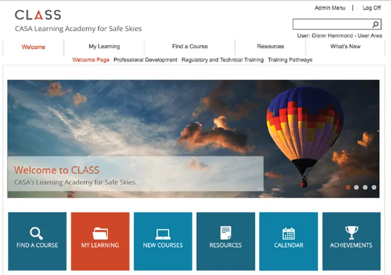
CLASS is an internal CASA learning platform. I designed and developed its learner-facing front end: the landing view, the navigation, and the patterns that made a large body of regulated learning navigable by the people who had to complete it.
01Information architecture
In 60 seconds
- The problem
- An internal learning platform serving several CASA audiences at once, where the default interface put administration ahead of the learner.
- My role
- Front-end design and development of the learner-facing experience.
- Scope
- Landing view, primary navigation, task-led entry points, course-listing patterns and front-end build. Editorial placeholder: Confirm platform scope
- Where it got to
- A learner-facing front end for CLASS. Editorial placeholder: Add measurable outcome
- Built with
- Editorial placeholder: Confirm technology and integration details
The situation
CLASS, the CASA Learning Academy for Safe Skies, is an internal platform. It is not public-facing, and nothing here should be read as a consumer product: its users are CASA staff, and its content includes induction, regulatory and technical training, and professional development.
A single learning platform serving induction, regulatory training and professional development has a discoverability problem before it has a design problem. The same person is a new starter, a technical specialist and a professional-development participant at different points in the same year.
What was actually wrong
The default answer to a mixed audience is a menu with everything on it. That works for the person who built the menu.
The design decision on CLASS was to lead with tasks rather than with categories. A learner arriving at the platform has one of a small number of intentions: find something, resume something, see what is new, or find a resource. Naming those intentions as the primary controls means most visits end in one click rather than in a browse.
What it looked like, and why
02Learning experience
Image to supplyThe My Learning panel, at a legible resolution
A capture of this screen exists but is around 710 pixels wide and cannot be enlarged without blurring the course titles and status labels. It also sits beside a panel carrying an internal training-administration email address, which is not published.
Key design decisions
Lead with tasks, not with the catalogue
- The choice
- Six large task tiles below the fold-line of the landing view, in place of a course listing.
- Why
- The platform's audiences share intentions even when they do not share content. Naming the intention gets a specialist and a new starter to different places from the same screen.
Keep course status on the row
- The choice
- Grade, status and the full action set are rendered inline in My Learning rather than behind a per-course menu.
- Why
- In a regulated environment the evidence of completion matters as much as the completion. Hiding the course report costs more clicks than the visual tidiness is worth.
Design the frame, accept the shell
- The choice
- Effort went into the landing view, navigation and course frame, not into fighting the platform's administrative screens.
- Why
- Designing for a platform you do not control means changing the parts you can actually change. Time spent on the parts you cannot is time not spent on the parts learners see.
Where it got to
- A learner-facing front end for CLASS, designed and developed in house
- A task-led landing pattern separating intention from subject matter
- Course-listing patterns carrying status, grade and reporting inline
- Editorial placeholder: Confirm number of courses/users
Usage, completion and satisfaction data for CLASS is not published and is not claimed here.