CASA program · Production
Creating a reusable Storyline production system.
A regulator producing regulated learning at volume has a consistency problem before it has a quality problem. The answer was a documented production system: templates, specified components, a navigation convention and an asset library the whole design team built from.
01Design systems
In 60 seconds
- The problem
- Several designers producing regulated aviation learning to different visual and interaction conventions.
- My role
- Designed and documented the production system, and maintained the asset libraries.
- Scope
- Style manual, Storyline, PowerPoint and InDesign templates, specified components with states, an icon and step-marker library, navigation conventions and multimedia treatments.
- Where it got to
- A production system the regulator's design team used to build courses. Editorial placeholder: Confirm governance and handover arrangements
- Built with
- Articulate Storyline · Adobe CC
The situation
By the time an organisation is producing enough learning to need more than one designer, it has a consistency problem. Two courses built to the same brief by two people will differ in navigation, in iconography, in how a video is presented and in what a disabled control looks like. Learners read that inconsistency as carelessness, and in a safety regulator carelessness is expensive.
The usual response is a style guide nobody opens. The alternative is a production system: the conventions are in the file you start from, so following them is easier than not.
What was actually wrong
The unit of reuse is not the template. It is the component and its states. A template that specifies layout but not behaviour still produces four different hover treatments.
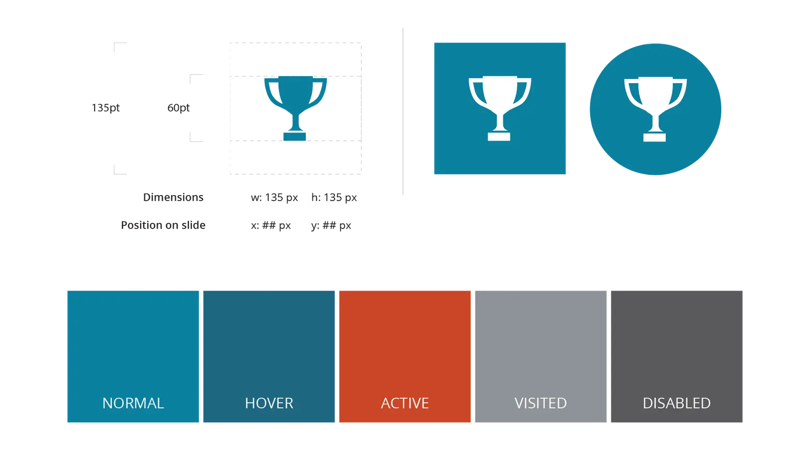
So each component was specified down to dimensions, slide position and its normal, hover, active, visited and disabled states. That is unglamorous work, and it is the reason several designers could produce something that read as one program.
What it looked like, and why
02Design systems
03Production systemsTemplate or prototype
04Production systemsTemplate or prototype
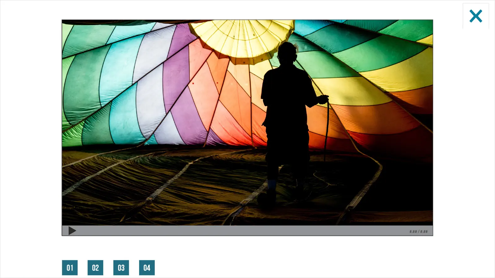
05Multimedia
Key design decisions
Specify states, not just layouts
- The choice
- Every reusable component was documented with dimensions, position and five interaction states.
- Why
- Layout-only templates still produce inconsistent behaviour. States are where the drift actually happens.
Number every step marker
- The choice
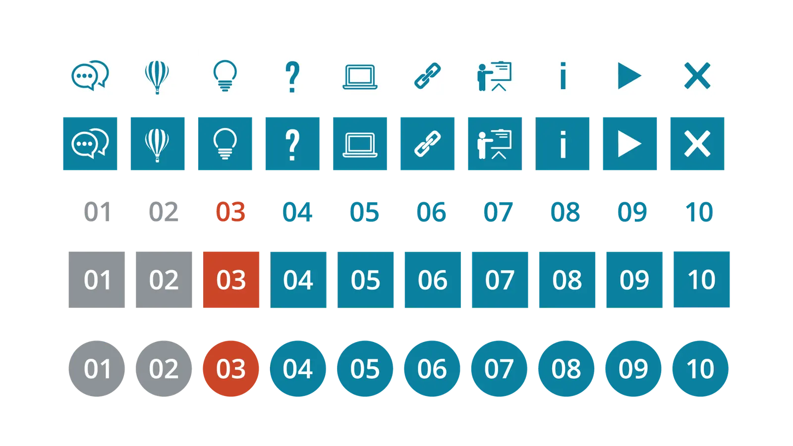
- Progression markers carry a numeral as well as a colour state.
- Why
- Colour alone excludes learners who cannot distinguish the current step from the remaining ones, and it fails entirely when a course is printed or projected.
Put the guidance in the file
- The choice
- Authoring instructions were written onto template slides rather than into a separate manual.
- Why
- A manual is a thing a designer has to remember to consult. A template slide is a thing they have to delete.
Where it got to
- A style manual with Storyline, PowerPoint and InDesign templates
- Specified components with documented dimensions, positions and states
- An icon and step-marker library in outline and inverted treatments
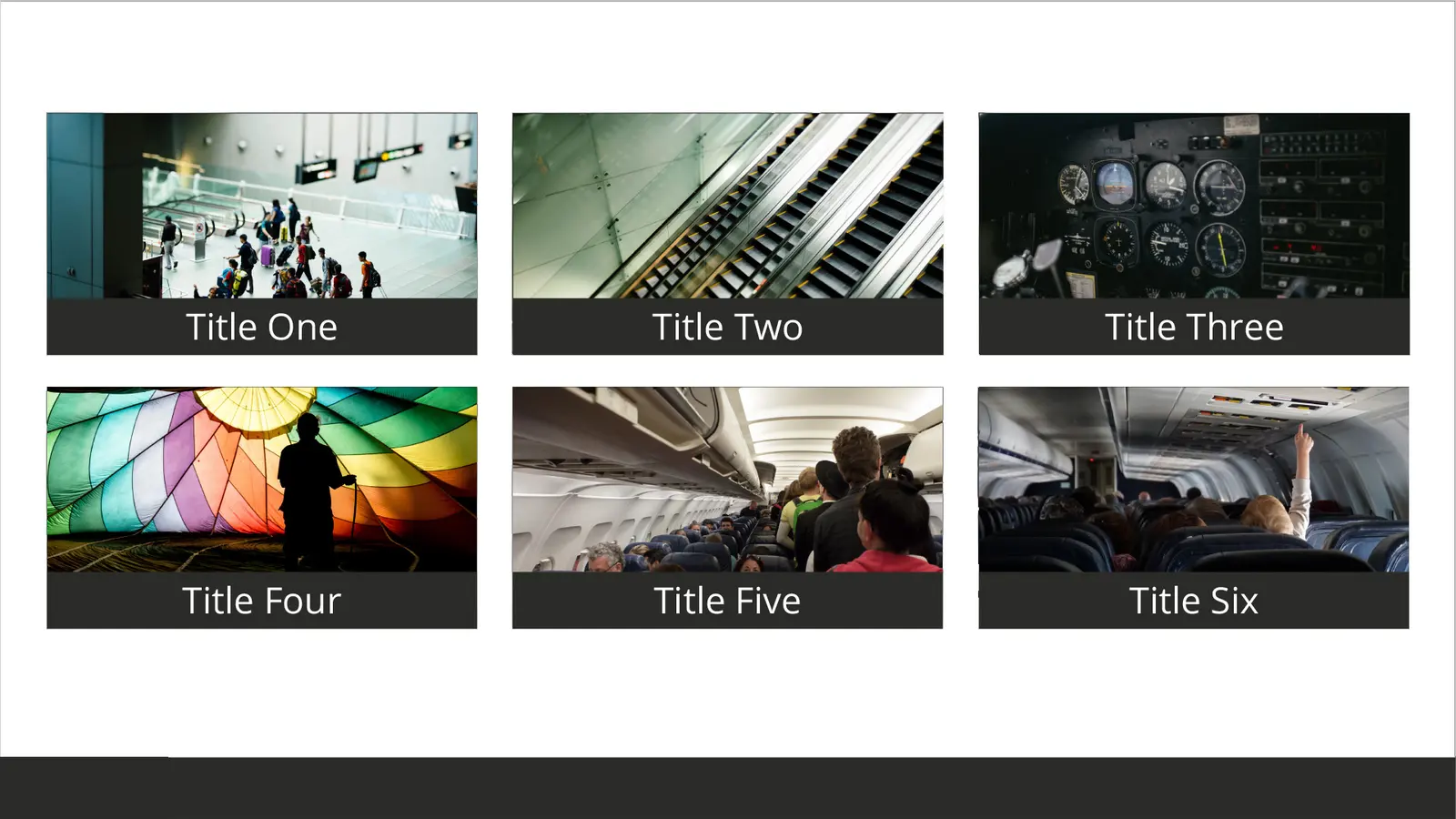
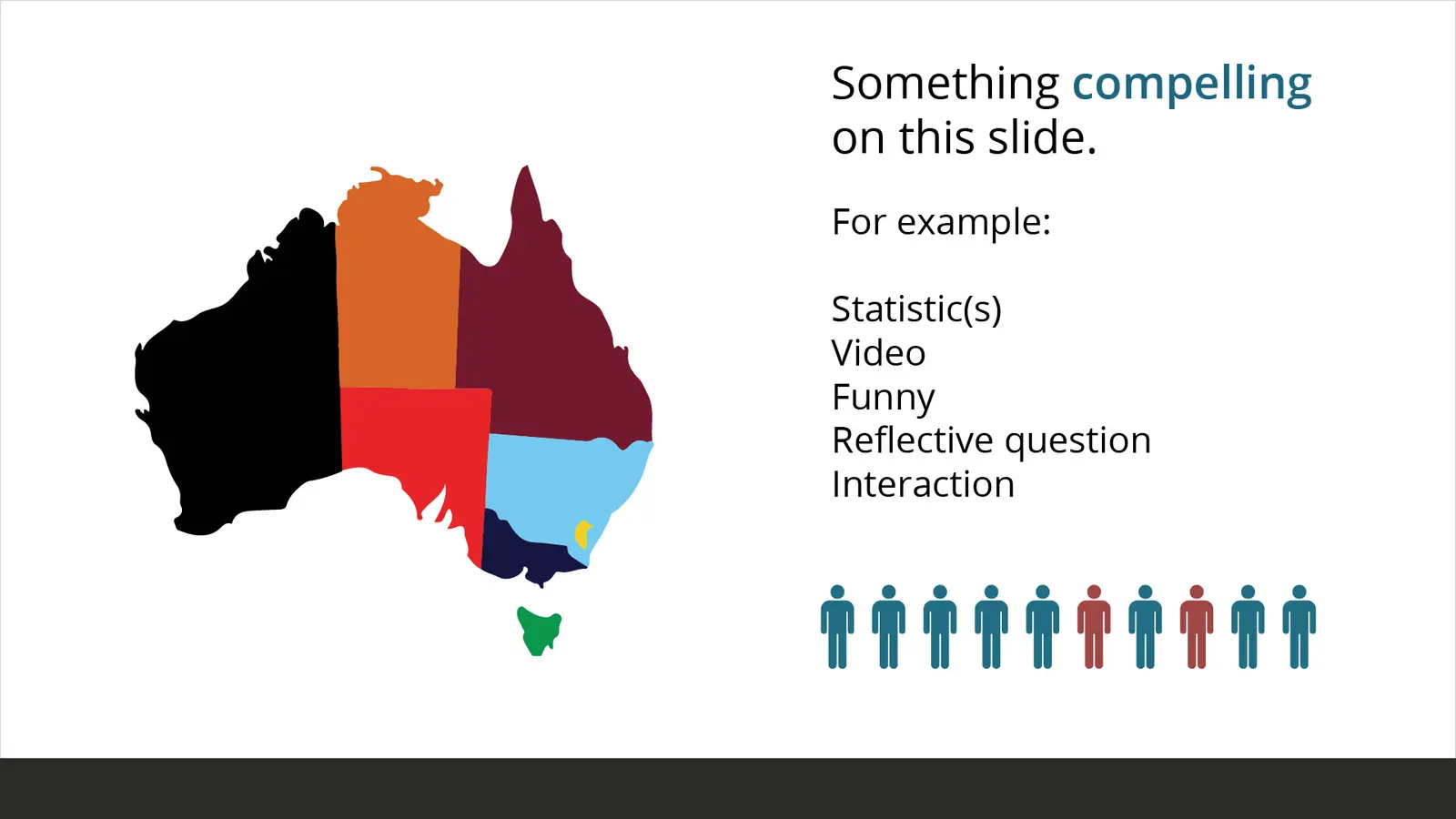
- A single video and multimedia treatment used across courses
- Editorial placeholder: Confirm governance, documentation and handover arrangements
Production volumes, time savings and team size are not published and are not claimed here.